
Fixing the Tracking Gap
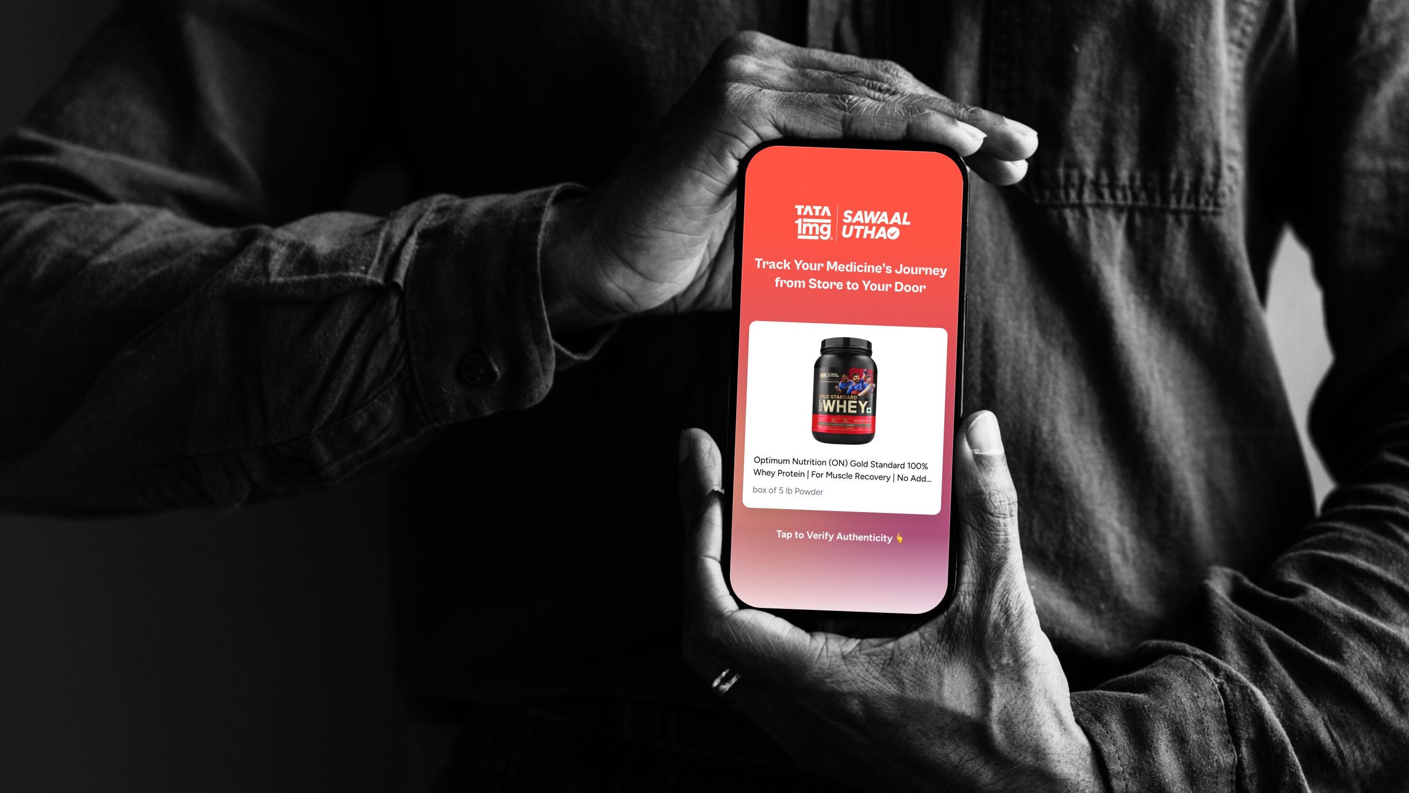
Redesigned Tata 1mg’s order tracking to deliver real-time updates, reduce customer anxiety, and cut support queries, boosting satisfaction.
Tracking
CX
Project Overview
Designing a Seamless Order Tracking Experience to Reduce Anxiety, Boost Transparency, and Keep Customers Confident Every Step of the Way
I redesigned Tata 1mg’s order tracking to deliver real-time, transparent updates for every stage of delivery. By placing status info upfront, enhancing detail pages, and sending timely notifications, the solution reduced customer anxiety, cut support queries, and improved satisfaction across the board.
Identified Problems
1. Lack of Order Visibility Led to Customer Anxiety and High Support Volume
Customers lacked real-time visibility into their order status, especially for time-sensitive quick commerce deliveries. This uncertainty led to frequent support queries via chat, mail, and voice—driving up service costs and negatively impacting customer satisfaction.
2. Current Order Tracking Experience Was Inadequate for Quick Commerce
The existing order tracking system was not optimized for the pace and expectations of quick commerce. It lacked real-time nuance, contextual updates, and clear progress indicators—making it difficult for customers to track orders confidently and independently.
3. Inefficient Information Architecture Increased Friction
Customers had to navigate through multiple screens to access basic order information. This friction contributed to confusion and a lack of trust, especially when dealing with high-value or time-sensitive orders
4. Support Channel Costs Were Unsustainable
Over 57% of queries were served via chat alone, contributing to a monthly support cost of ₹1.2 crore. A significant portion of this cost was driven by simple order status inquiries—highlighting a clear opportunity for UX-led automation and self-service design.

Design Strategy & Implementations
Seamless, At-a-Glance Order Visibility
Single Order View
Users see live order status instantly after placement—minimizing the need to navigate or search for updates.Multi-Order Management
A compact notch indicates additional active orders; tapping expands to a list sorted chronologically with the oldest order first.State Awareness
Handled various states—success, error, or delayed—with clear feedback and actionable options (e.g., retry, call support, etc.).Live Data Sync
Real-time polling ensures order updates reflect the latest status, providing users with a trustworthy tracking experience directly on the home screen.
Deep Transparency
Enhanced 'My Orders' and 'Order Details' Pages
Nuanced Status Tags
Introduced expressive order statuses like "On time", "Slightly delayed", or "Cancelled by delivery partner", to set accurate expectations.Concise Order Summary
Prominently displayed ETAs like "Arriving by 7:30 PM" or "Delivered in 17 mins", reducing ambiguity and wait-time anxiety.Contextual Information
Added critical info such as:3rd-party delivery partner name
OTP required for handoff
Prescription validation status
Visual Progress Bar
A horizontal tracker illustrated the full order lifecycle, from placement to delivery, helping users anticipate the next step.Visual Design Enhancements
Used color-coded states, subtle animations, and intuitive icons to reduce reliance on text while improving comprehension.

Notifications
Live Notifications: Instant Awareness Without Opening the App
Stage-Based Notifications
Users received updates at each critical milestone—order placed, packed, out for delivery, and delivered.Lock Screen Access
Notifications designed for quick glancing—reducing the need to open the app for updates.Latency-Optimized Architecture
Notifications were aligned with backend order updates, ensuring reliability and immediacy.
Results
AOR Reduced by 1.8 Percentage Points
Surpassed the target reduction, significantly lowering customer support dependency for order-related queries.High Engagement with Bottomsheet Widget
Users actively interacted with the new bottomsheet, especially for quick commerce orders. Multi-order visibility added clear utility.CSAT Improvement
Users expressed greater satisfaction and reduced anxiety—reflected in a 1.67% lift in CSAT scores during the test window.No Drop in Conversion or Homepage Engagement
Despite the new component being introduced on the homepage, key business metrics remained stable—proving the solution was non-intrusive.Better Order Transparency = Better Experience
Users praised the improved tracking details, contextual order tags, and visual progress indicators for their clarity and usefulness.Real-Time Notifications Drove Engagement
Notification click-through and interaction rates were notably high(0.05% -> 26.88%), indicating strong user interest in proactive, real-time updates.
Collaborators
Built with Brilliant Minds
Acknowledging the designers who turned vision into impact — meet the people who made it possible.

More Works

FAQ
01
What makes your design process unique?
02
Have you worked on MVPs or 0-to-1 product journeys?
03
What is your design process like from research to handoff?
04
How do you handle tight deadlines or scope changes in a project?
05
How do you handle design critiques or conflicting feedback?
Fixing the Tracking Gap
Redesigned Tata 1mg’s order tracking to deliver real-time updates, reduce customer anxiety, and cut support queries, boosting satisfaction.
Tracking
CX
Project Overview
Designing a Seamless Order Tracking Experience to Reduce Anxiety, Boost Transparency, and Keep Customers Confident Every Step of the Way
I redesigned Tata 1mg’s order tracking to deliver real-time, transparent updates for every stage of delivery. By placing status info upfront, enhancing detail pages, and sending timely notifications, the solution reduced customer anxiety, cut support queries, and improved satisfaction across the board.
Identified Problems
1. Lack of Order Visibility Led to Customer Anxiety and High Support Volume
Customers lacked real-time visibility into their order status, especially for time-sensitive quick commerce deliveries. This uncertainty led to frequent support queries via chat, mail, and voice—driving up service costs and negatively impacting customer satisfaction.
2. Current Order Tracking Experience Was Inadequate for Quick Commerce
The existing order tracking system was not optimized for the pace and expectations of quick commerce. It lacked real-time nuance, contextual updates, and clear progress indicators—making it difficult for customers to track orders confidently and independently.
3. Inefficient Information Architecture Increased Friction
Customers had to navigate through multiple screens to access basic order information. This friction contributed to confusion and a lack of trust, especially when dealing with high-value or time-sensitive orders
4. Support Channel Costs Were Unsustainable
Over 57% of queries were served via chat alone, contributing to a monthly support cost of ₹1.2 crore. A significant portion of this cost was driven by simple order status inquiries—highlighting a clear opportunity for UX-led automation and self-service design.
Design Strategy & Implementations
Seamless, At-a-Glance Order Visibility
Single Order View
Users see live order status instantly after placement—minimizing the need to navigate or search for updates.Multi-Order Management
A compact notch indicates additional active orders; tapping expands to a list sorted chronologically with the oldest order first.State Awareness
Handled various states—success, error, or delayed—with clear feedback and actionable options (e.g., retry, call support, etc.).Live Data Sync
Real-time polling ensures order updates reflect the latest status, providing users with a trustworthy tracking experience directly on the home screen.
Deep Transparency
Enhanced 'My Orders' and 'Order Details' Pages
Nuanced Status Tags
Introduced expressive order statuses like "On time", "Slightly delayed", or "Cancelled by delivery partner", to set accurate expectations.Concise Order Summary
Prominently displayed ETAs like "Arriving by 7:30 PM" or "Delivered in 17 mins", reducing ambiguity and wait-time anxiety.Contextual Information
Added critical info such as:3rd-party delivery partner name
OTP required for handoff
Prescription validation status
Visual Progress Bar
A horizontal tracker illustrated the full order lifecycle, from placement to delivery, helping users anticipate the next step.Visual Design Enhancements
Used color-coded states, subtle animations, and intuitive icons to reduce reliance on text while improving comprehension.
Notifications
Live Notifications: Instant Awareness Without Opening the App
Stage-Based Notifications
Users received updates at each critical milestone—order placed, packed, out for delivery, and delivered.Lock Screen Access
Notifications designed for quick glancing—reducing the need to open the app for updates.Latency-Optimized Architecture
Notifications were aligned with backend order updates, ensuring reliability and immediacy.
Results
AOR Reduced by 1.8 Percentage Points
Surpassed the target reduction, significantly lowering customer support dependency for order-related queries.High Engagement with Bottomsheet Widget
Users actively interacted with the new bottomsheet, especially for quick commerce orders. Multi-order visibility added clear utility.CSAT Improvement
Users expressed greater satisfaction and reduced anxiety—reflected in a 1.67% lift in CSAT scores during the test window.No Drop in Conversion or Homepage Engagement
Despite the new component being introduced on the homepage, key business metrics remained stable—proving the solution was non-intrusive.Better Order Transparency = Better Experience
Users praised the improved tracking details, contextual order tags, and visual progress indicators for their clarity and usefulness.Real-Time Notifications Drove Engagement
Notification click-through and interaction rates were notably high(0.05% -> 26.88%), indicating strong user interest in proactive, real-time updates.
Collaborators
Built with Brilliant Minds
Acknowledging the designers who turned vision into impact — meet the people who made it possible.
More Works
FAQ
What makes your design process unique?
Have you worked on MVPs or 0-to-1 product journeys?
What is your design process like from research to handoff?
How do you handle tight deadlines or scope changes in a project?
How do you handle design critiques or conflicting feedback?